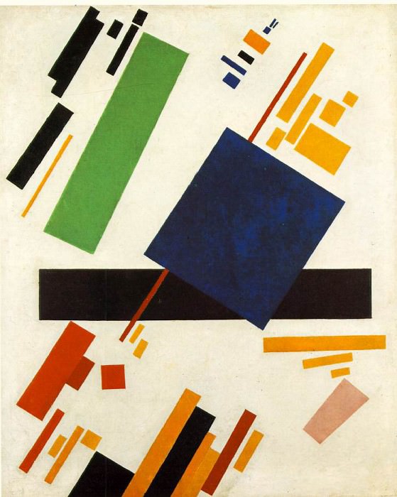
Malevitj Suprema painting 1916, Stedelijk Museum, Amsterdam Kazimir Malevich (1879-1935)
Kazimir Malevich – Malevitj Suprema painting 1916, Stedelijk Museum, Amsterdam
Edit attribution
Download full size: 745×934 px (0,1 Mb)
Painter: Kazimir Malevich
This painting is a rectangle of blue on top of a red colored beam. The composition was painted by Malevich in 1916. It is one of the rarest and most expensive works in Russian art history. Through his paintings, Malevich had a powerful influence on the ideology of art around the world. The rectangles in the picture are dynamic and bright, and in the middle of the composition is a small blue square.
Description of the painting "Suprematist Composition" by Kazimir Malevich
This painting is a rectangle of blue on top of a red colored beam. The composition was painted by Malevich in 1916. It is one of the rarest and most expensive works in Russian art history.
Through his paintings, Malevich had a powerful influence on the ideology of art around the world. The rectangles in the picture are dynamic and bright, and in the middle of the composition is a small blue square. This picture is painted in between the Black Square and White Suprematism.
Suprematism was founded by Malevich himself, this artist defined abstract compositions. The word Suprematism means a kind of superiority and domination.
Suprematism is about ignoring the reality of the image. It is a protest against all naturalism in painting and art. That is, the composition is reduced to a few simple figures, which have their own symbolic meaning. Geometric images as if immersed in the space of a white abyss, and dominate the laws of statics and dynamics.
Suprematism emphasizes the role of geometric shapes themselves, putting their colors in the background. Later, Malevich’s Suprematism began to manifest itself in architectural art. So, geometric images of deep content began to appear not only on canvases, but also on dishes, the walls of various buildings.
As we can see, Suprematist composition is not as simple as it seems at first glance. The master laid his own concept and meaning in the creation of this picture. And, looking at it, everyone can see in a peculiar way the nature of the great artist. Some will see his inner essence, the depth of his rich world of imagination. Others, perhaps, will notice that the simplest things in our lives can take on greater significance. It all depends on how we look at things.
Кому понравилось
Пожалуйста, подождите
На эту операцию может потребоваться несколько секунд.
Информация появится в новом окне,
если открытие новых окон не запрещено в настройках вашего браузера.
You need to login
Для работы с коллекциями – пожалуйста, войдите в аккаунт (open in new window).


You cannot comment Why?
The central element is a large, deep blue square, positioned slightly off-center. This form dominates the visual field, yet it does not assert absolute authority due to its interaction with the surrounding elements. The other shapes seem to orbit around this core, establishing relationships that are both visually engaging and conceptually intriguing.
Several of the rectangles appear fragmented or incomplete, suggesting a process of deconstruction or abstraction. Their sharp angles and abrupt terminations contribute to the overall feeling of dynamism. The artist’s deliberate use of negative space – the white background – is crucial; it allows each shape to breathe and prevents the composition from becoming visually cluttered.
Subtly, theres an implication of architectural elements – perhaps abstracted window frames or building facades – though any literal interpretation is actively discouraged by the work’s non-representational nature. The arrangement evokes a sense of urban dynamism, hinting at the rapid industrialization and technological advancements occurring during its creation. The color choices – the coolness of blue contrasted with the warmth of orange and green – further enhance this feeling of tension and energy.
Ultimately, the painting seems to be less about depicting something specific and more about exploring the fundamental properties of form, color, and space. It invites contemplation on the nature of perception and the possibilities inherent in abstract expression. The work’s power resides not in what it represents but in its capacity to generate a purely visual experience – one that transcends conventional notions of subject matter and narrative.